Lately I’ve
been seeing a lot of layouts featuring a big picture and I wanted to give that
trend a go. The pinks in the Paper Camellia's February kit worked really well with a greyish
black&white photo. Normally I
use a lot of white space in my layouts. This layout was a challenge to me as
there wasn’t a lot of empty space. That’s why I decided to keep the whole
layout really simple and used only a small number of embellishments.
Those
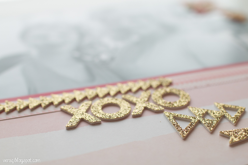
glitter stickers from Crate Paper were a pleasant surprise! I was worried that
there would be glitter all over when I open the package, but that wasn’t the
case. Those glitter accents were perfect to bring a little bling to this
layout.
As the
picture was so huge, I wanted to decorate it too a little bit. As there was an
empty space on the top right corner, I cut some banners from the papers and
added some hearts too.
Materials: Paper Camellia's February main kit


.jpg)
.jpg)


.png)


.jpg)
.jpg)
.png)
.jpg)


